This vignette walks through how to create consistent graphics that meet ATLAS formatting standards using {ggplot2}. The {ggplot2} package uses the grammar of graphics to create elegant and reproducible plots that are publication ready. The {ratlas} package provides an extension to {ggplot2} by customizing the default theme to match brand requirements.
Introduction to ggplot2
A full tutorial of how to use {ggplot2} is beyond the scope of this vignette. If you are new to {ggplot2}, we recommend you start with these resources:
- Data Visualisation in R for Data Science, by Hadley Wickham & Garrett Grolemund
- Data Visualization, by Kieran Healy
- R Graphics Cookbook, by Winston Chang
These resources walk through how {ggplot2} works, and provide examples with code for creating different types of plots. For a more in depth description of how {ggplot2} works, we recommend ggplot2: Elegant Graphics for Data Analysis, by Hadley Wickham.
To demonstrate how to use the ATLAS theme for {ggplot2}, we will use the following example plot of the mtcars data set (Figure 1).
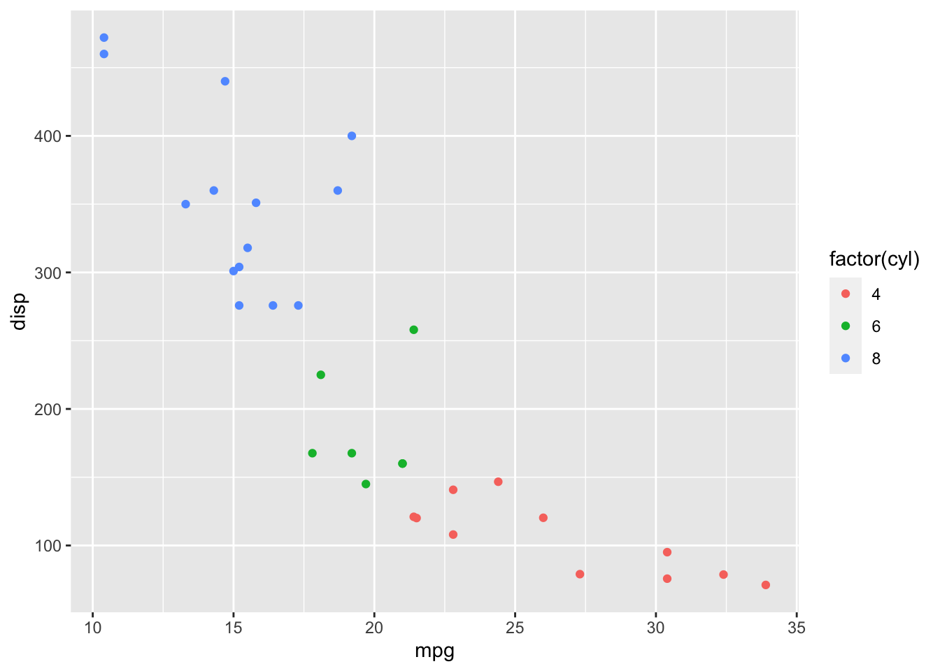
Figure 1: Default {ggplot2} theme.
Using theme_atlas()
The ATLAS {ggplot2} theme can be applied by adding a ratlas::theme_atlas() layer to plot, just as you would add any other theme. The result is shown in Figure 2.
library(ratlas)

ggplot(mtcars, aes(x = mpg, y = disp)) +
  geom_point(aes(color = factor(cyl))) +
  theme_atlas()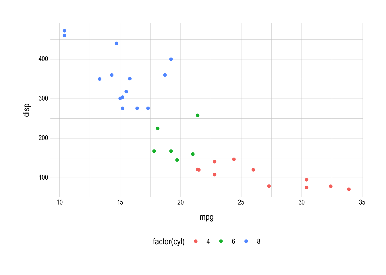
Figure 2: The result of applying ratlas::theme_atlas() to a plot.
There are a few points to draw attention to when comparing Figure 2 back to Figure 1. First, the gray background has been removed, and the grid lines have been changed from white to gray. Second, the legend has been moved from a vertical orientation on the right-hand side of the plot to a horizontal orientation below the plot. Finally, the font has been changed to Arial Narrow, which should be available on all systems and provides a more modern look.
Changing the font
Although Arial Narrow provides a modern font available on all systems, it is often desirable to have a font that matches the brand requirements. The official font of the University of Kansas and ATLAS is Gotham. However, this font is expensive, and thus inaccessible to most users. Montserrat is a very similar font that is available for free through Google Fonts. We recommend that you load this font with the {showtext} package. This will load fonts that are available online through Google Fonts, and then tell R to render text using {showtext} by calling the showtext_auto() function.
library(showtext)
## Loading Google fonts (https://fonts.google.com/)
font_add_google("Montserrat", "montserrat")

## Automatically use showtext to render text
showtext_auto()
Once the Montserrat font has been loaded, you can apply it to the ATLAS theme using ratlas::theme_atlas(base_family = "Montserrat").
ggplot(mtcars, aes(x = mpg, y = disp)) +
  geom_point(aes(color = factor(cyl))) +
  theme_atlas(base_family = "Montserrat")
Colors
One potential issue with graphics created with {ggplot2} is that the default color scales are not colorblind friendly. For example, Figure 3 shows our working example simulated with different types of color blindness.
#> Warning in grid.Call(C_textBounds, as.graphicsAnnot(x$label), x$x, x$y, : font
#> family 'Arial Narrow' not found in PostScript font database
#> Warning in grid.Call(C_stringMetric, as.graphicsAnnot(x$label)): font family
#> 'Arial Narrow' not found in PostScript font database
#> Warning in grid.Call(C_stringMetric, as.graphicsAnnot(x$label)): font family
#> 'Arial Narrow' not found in PostScript font database
#> Warning in grid.Call(C_stringMetric, as.graphicsAnnot(x$label)): font family
#> 'Arial Narrow' not found in PostScript font database
#> Warning in grid.Call(C_stringMetric, as.graphicsAnnot(x$label)): font family
#> 'Arial Narrow' not found in PostScript font database
#> Warning in grid.Call(C_stringMetric, as.graphicsAnnot(x$label)): font family
#> 'Arial Narrow' not found in PostScript font database
#> Warning in grid.Call(C_stringMetric, as.graphicsAnnot(x$label)): font family
#> 'Arial Narrow' not found in PostScript font database
#> Warning in grid.Call(C_stringMetric, as.graphicsAnnot(x$label)): font family
#> 'Arial Narrow' not found in PostScript font database
#> Warning in grid.Call(C_stringMetric, as.graphicsAnnot(x$label)): font family
#> 'Arial Narrow' not found in PostScript font database
#> Warning in grid.Call(C_stringMetric, as.graphicsAnnot(x$label)): font family
#> 'Arial Narrow' not found in PostScript font database
#> Warning in grid.Call(C_stringMetric, as.graphicsAnnot(x$label)): font family
#> 'Arial Narrow' not found in PostScript font database
#> Warning in grid.Call(C_stringMetric, as.graphicsAnnot(x$label)): font family
#> 'Arial Narrow' not found in PostScript font database
#> Warning in grid.Call(C_stringMetric, as.graphicsAnnot(x$label)): font family
#> 'Arial Narrow' not found in PostScript font database
#> Warning in grid.Call(C_stringMetric, as.graphicsAnnot(x$label)): font family
#> 'Arial Narrow' not found in PostScript font database
#> Warning in grid.Call(C_textBounds, as.graphicsAnnot(x$label), x$x, x$y, : font
#> family 'Arial Narrow' not found in PostScript font database
#> Warning in grid.Call(C_textBounds, as.graphicsAnnot(x$label), x$x, x$y, : font
#> family 'Arial Narrow' not found in PostScript font database
#> Warning in grid.Call(C_textBounds, as.graphicsAnnot(x$label), x$x, x$y, : font
#> family 'Arial Narrow' not found in PostScript font database
#> Warning in grid.Call(C_textBounds, as.graphicsAnnot(x$label), x$x, x$y, : font
#> family 'Arial Narrow' not found in PostScript font database
#> Warning in grid.Call(C_textBounds, as.graphicsAnnot(x$label), x$x, x$y, : font
#> family 'Arial Narrow' not found in PostScript font database
#> Warning in grid.Call(C_textBounds, as.graphicsAnnot(x$label), x$x, x$y, : font
#> family 'Arial Narrow' not found in PostScript font database
#> Warning in grid.Call(C_textBounds, as.graphicsAnnot(x$label), x$x, x$y, : font
#> family 'Arial Narrow' not found in PostScript font database
#> Warning in grid.Call(C_textBounds, as.graphicsAnnot(x$label), x$x, x$y, : font
#> family 'Arial Narrow' not found in PostScript font database
#> Warning in grid.Call(C_textBounds, as.graphicsAnnot(x$label), x$x, x$y, : font
#> family 'Arial Narrow' not found in PostScript font database
#> Warning in grid.Call(C_textBounds, as.graphicsAnnot(x$label), x$x, x$y, : font
#> family 'Arial Narrow' not found in PostScript font database
#> Warning in grid.Call(C_textBounds, as.graphicsAnnot(x$label), x$x, x$y, : font
#> family 'Arial Narrow' not found in PostScript font database
#> Warning in grid.Call(C_textBounds, as.graphicsAnnot(x$label), x$x, x$y, : font
#> family 'Arial Narrow' not found in PostScript font database
#> Warning in grid.Call(C_textBounds, as.graphicsAnnot(x$label), x$x, x$y, : font
#> family 'Arial Narrow' not found in PostScript font database
#> Warning in grid.Call(C_textBounds, as.graphicsAnnot(x$label), x$x, x$y, : font
#> family 'Arial Narrow' not found in PostScript font database
#> Warning in grid.Call(C_textBounds, as.graphicsAnnot(x$label), x$x, x$y, : font
#> family 'Arial Narrow' not found in PostScript font database
#> Warning in grid.Call(C_textBounds, as.graphicsAnnot(x$label), x$x, x$y, : font
#> family 'Arial Narrow' not found in PostScript font database
#> Warning in grid.Call(C_textBounds, as.graphicsAnnot(x$label), x$x, x$y, : font
#> family 'Arial Narrow' not found in PostScript font database
#> Warning in grid.Call(C_textBounds, as.graphicsAnnot(x$label), x$x, x$y, : font
#> family 'Arial Narrow' not found in PostScript font database
#> Warning in grid.Call(C_textBounds, as.graphicsAnnot(x$label), x$x, x$y, : font
#> family 'Arial Narrow' not found in PostScript font database
#> Warning in grid.Call(C_textBounds, as.graphicsAnnot(x$label), x$x, x$y, : font
#> family 'Arial Narrow' not found in PostScript font database
#> Warning in grid.Call(C_textBounds, as.graphicsAnnot(x$label), x$x, x$y, : font
#> family 'Arial Narrow' not found in PostScript font database
#> Warning in grid.Call(C_textBounds, as.graphicsAnnot(x$label), x$x, x$y, : font
#> family 'Arial Narrow' not found in PostScript font database
#> Warning in grid.Call(C_stringMetric, as.graphicsAnnot(x$label)): font family
#> 'Arial Narrow' not found in PostScript font database
#> Warning in grid.Call(C_stringMetric, as.graphicsAnnot(x$label)): font family
#> 'Arial Narrow' not found in PostScript font database
#> Warning in grid.Call(C_stringMetric, as.graphicsAnnot(x$label)): font family
#> 'Arial Narrow' not found in PostScript font database
#> Warning in grid.Call(C_stringMetric, as.graphicsAnnot(x$label)): font family
#> 'Arial Narrow' not found in PostScript font database
#> Warning in grid.Call(C_stringMetric, as.graphicsAnnot(x$label)): font family
#> 'Arial Narrow' not found in PostScript font database
#> Warning in grid.Call(C_stringMetric, as.graphicsAnnot(x$label)): font family
#> 'Arial Narrow' not found in PostScript font database
#> Warning in grid.Call(C_stringMetric, as.graphicsAnnot(x$label)): font family
#> 'Arial Narrow' not found in PostScript font database
#> Warning in grid.Call(C_stringMetric, as.graphicsAnnot(x$label)): font family
#> 'Arial Narrow' not found in PostScript font database
#> Warning in grid.Call(C_stringMetric, as.graphicsAnnot(x$label)): font family
#> 'Arial Narrow' not found in PostScript font database
#> Warning in grid.Call(C_stringMetric, as.graphicsAnnot(x$label)): font family
#> 'Arial Narrow' not found in PostScript font database
#> Warning in grid.Call(C_stringMetric, as.graphicsAnnot(x$label)): font family
#> 'Arial Narrow' not found in PostScript font database
#> Warning in grid.Call(C_stringMetric, as.graphicsAnnot(x$label)): font family
#> 'Arial Narrow' not found in PostScript font database
#> Warning in grid.Call(C_stringMetric, as.graphicsAnnot(x$label)): font family
#> 'Arial Narrow' not found in PostScript font database
#> Warning in grid.Call(C_textBounds, as.graphicsAnnot(x$label), x$x, x$y, : font
#> family 'Arial Narrow' not found in PostScript font database
#> Warning in grid.Call(C_textBounds, as.graphicsAnnot(x$label), x$x, x$y, : font
#> family 'Arial Narrow' not found in PostScript font database
#> Warning in grid.Call(C_textBounds, as.graphicsAnnot(x$label), x$x, x$y, : font
#> family 'Arial Narrow' not found in PostScript font database
#> Warning in grid.Call(C_textBounds, as.graphicsAnnot(x$label), x$x, x$y, : font
#> family 'Arial Narrow' not found in PostScript font database
#> Warning in grid.Call(C_textBounds, as.graphicsAnnot(x$label), x$x, x$y, : font
#> family 'Arial Narrow' not found in PostScript font database
#> Warning in grid.Call(C_stringMetric, as.graphicsAnnot(x$label)): font family
#> 'Arial Narrow' not found in PostScript font database
#> Warning in grid.Call(C_stringMetric, as.graphicsAnnot(x$label)): font family
#> 'Arial Narrow' not found in PostScript font database
#> Warning in grid.Call(C_stringMetric, as.graphicsAnnot(x$label)): font family
#> 'Arial Narrow' not found in PostScript font database
#> Warning in grid.Call(C_stringMetric, as.graphicsAnnot(x$label)): font family
#> 'Arial Narrow' not found in PostScript font database
#> Warning in grid.Call(C_stringMetric, as.graphicsAnnot(x$label)): font family
#> 'Arial Narrow' not found in PostScript font database
#> Warning in grid.Call(C_stringMetric, as.graphicsAnnot(x$label)): font family
#> 'Arial Narrow' not found in PostScript font database
#> Warning in grid.Call(C_stringMetric, as.graphicsAnnot(x$label)): font family
#> 'Arial Narrow' not found in PostScript font database
#> Warning in grid.Call(C_stringMetric, as.graphicsAnnot(x$label)): font family
#> 'Arial Narrow' not found in PostScript font database
#> Warning in grid.Call(C_stringMetric, as.graphicsAnnot(x$label)): font family
#> 'Arial Narrow' not found in PostScript font database
#> Warning in grid.Call(C_stringMetric, as.graphicsAnnot(x$label)): font family
#> 'Arial Narrow' not found in PostScript font database
#> Warning in grid.Call(C_stringMetric, as.graphicsAnnot(x$label)): font family
#> 'Arial Narrow' not found in PostScript font database
#> Warning in grid.Call(C_stringMetric, as.graphicsAnnot(x$label)): font family
#> 'Arial Narrow' not found in PostScript font database
#> Warning in grid.Call(C_stringMetric, as.graphicsAnnot(x$label)): font family
#> 'Arial Narrow' not found in PostScript font database
#> Warning in grid.Call(C_stringMetric, as.graphicsAnnot(x$label)): font family
#> 'Arial Narrow' not found in PostScript font database
#> Warning in grid.Call(C_stringMetric, as.graphicsAnnot(x$label)): font family
#> 'Arial Narrow' not found in PostScript font database
#> Warning in grid.Call(C_stringMetric, as.graphicsAnnot(x$label)): font family
#> 'Arial Narrow' not found in PostScript font database
#> Warning in grid.Call(C_stringMetric, as.graphicsAnnot(x$label)): font family
#> 'Arial Narrow' not found in PostScript font database
#> Warning in grid.Call(C_stringMetric, as.graphicsAnnot(x$label)): font family
#> 'Arial Narrow' not found in PostScript font database
#> Warning in grid.Call(C_stringMetric, as.graphicsAnnot(x$label)): font family
#> 'Arial Narrow' not found in PostScript font database
#> Warning in grid.Call(C_stringMetric, as.graphicsAnnot(x$label)): font family
#> 'Arial Narrow' not found in PostScript font database
#> Warning in grid.Call(C_stringMetric, as.graphicsAnnot(x$label)): font family
#> 'Arial Narrow' not found in PostScript font database
#> Warning in grid.Call(C_stringMetric, as.graphicsAnnot(x$label)): font family
#> 'Arial Narrow' not found in PostScript font database
#> Warning in grid.Call(C_stringMetric, as.graphicsAnnot(x$label)): font family
#> 'Arial Narrow' not found in PostScript font database
#> Warning in grid.Call(C_stringMetric, as.graphicsAnnot(x$label)): font family
#> 'Arial Narrow' not found in PostScript font database
#> Warning in grid.Call(C_stringMetric, as.graphicsAnnot(x$label)): font family
#> 'Arial Narrow' not found in PostScript font database
#> Warning in grid.Call(C_stringMetric, as.graphicsAnnot(x$label)): font family
#> 'Arial Narrow' not found in PostScript font database
#> Warning in grid.Call(C_stringMetric, as.graphicsAnnot(x$label)): font family
#> 'Arial Narrow' not found in PostScript font database
#> Warning in grid.Call(C_textBounds, as.graphicsAnnot(x$label), x$x, x$y, : font
#> family 'Arial Narrow' not found in PostScript font database
#> Warning in grid.Call(C_textBounds, as.graphicsAnnot(x$label), x$x, x$y, : font
#> family 'Arial Narrow' not found in PostScript font database
#> Warning in grid.Call(C_textBounds, as.graphicsAnnot(x$label), x$x, x$y, : font
#> family 'Arial Narrow' not found in PostScript font database
#> Warning in grid.Call(C_textBounds, as.graphicsAnnot(x$label), x$x, x$y, : font
#> family 'Arial Narrow' not found in PostScript font database
#> Warning in grid.Call(C_textBounds, as.graphicsAnnot(x$label), x$x, x$y, : font
#> family 'Arial Narrow' not found in PostScript font database
#> Warning in grid.Call(C_textBounds, as.graphicsAnnot(x$label), x$x, x$y, : font
#> family 'Arial Narrow' not found in PostScript font database
#> Warning in grid.Call(C_textBounds, as.graphicsAnnot(x$label), x$x, x$y, : font
#> family 'Arial Narrow' not found in PostScript font database
#> Warning in grid.Call(C_textBounds, as.graphicsAnnot(x$label), x$x, x$y, : font
#> family 'Arial Narrow' not found in PostScript font database
#> Warning in grid.Call(C_textBounds, as.graphicsAnnot(x$label), x$x, x$y, : font
#> family 'Arial Narrow' not found in PostScript font database
#> Warning in grid.Call(C_textBounds, as.graphicsAnnot(x$label), x$x, x$y, : font
#> family 'Arial Narrow' not found in PostScript font database
#> Warning in grid.Call(C_textBounds, as.graphicsAnnot(x$label), x$x, x$y, : font
#> family 'Arial Narrow' not found in PostScript font database
#> Warning in grid.Call(C_textBounds, as.graphicsAnnot(x$label), x$x, x$y, : font
#> family 'Arial Narrow' not found in PostScript font database
#> Warning in grid.Call(C_textBounds, as.graphicsAnnot(x$label), x$x, x$y, : font
#> family 'Arial Narrow' not found in PostScript font database
#> Warning in grid.Call(C_textBounds, as.graphicsAnnot(x$label), x$x, x$y, : font
#> family 'Arial Narrow' not found in PostScript font database
#> Warning in grid.Call(C_textBounds, as.graphicsAnnot(x$label), x$x, x$y, : font
#> family 'Arial Narrow' not found in PostScript font database
#> Warning in grid.Call(C_textBounds, as.graphicsAnnot(x$label), x$x, x$y, : font
#> family 'Arial Narrow' not found in PostScript font database
#> Warning in grid.Call(C_textBounds, as.graphicsAnnot(x$label), x$x, x$y, : font
#> family 'Arial Narrow' not found in PostScript font database
#> Warning in grid.Call(C_textBounds, as.graphicsAnnot(x$label), x$x, x$y, : font
#> family 'Arial Narrow' not found in PostScript font database
#> Warning in grid.Call(C_textBounds, as.graphicsAnnot(x$label), x$x, x$y, : font
#> family 'Arial Narrow' not found in PostScript font database
#> Warning in grid.Call(C_textBounds, as.graphicsAnnot(x$label), x$x, x$y, : font
#> family 'Arial Narrow' not found in PostScript font database
#> Warning in grid.Call(C_textBounds, as.graphicsAnnot(x$label), x$x, x$y, : font
#> family 'Arial Narrow' not found in PostScript font database
#> Warning in grid.Call(C_textBounds, as.graphicsAnnot(x$label), x$x, x$y, : font
#> family 'Arial Narrow' not found in PostScript font database
#> Warning in grid.Call(C_textBounds, as.graphicsAnnot(x$label), x$x, x$y, : font
#> family 'Arial Narrow' not found in PostScript font database
#> Warning in grid.Call(C_textBounds, as.graphicsAnnot(x$label), x$x, x$y, : font
#> family 'Arial Narrow' not found in PostScript font database
#> Warning in grid.Call(C_textBounds, as.graphicsAnnot(x$label), x$x, x$y, : font
#> family 'Arial Narrow' not found in PostScript font database
#> Warning in grid.Call(C_textBounds, as.graphicsAnnot(x$label), x$x, x$y, : font
#> family 'Arial Narrow' not found in PostScript font database
#> Warning in grid.Call(C_textBounds, as.graphicsAnnot(x$label), x$x, x$y, : font
#> family 'Arial Narrow' not found in PostScript font database
#> Warning in grid.Call(C_textBounds, as.graphicsAnnot(x$label), x$x, x$y, : font
#> family 'Arial Narrow' not found in PostScript font database
#> Warning in grid.Call(C_textBounds, as.graphicsAnnot(x$label), x$x, x$y, : font
#> family 'Arial Narrow' not found in PostScript font database
#> Warning in grid.Call(C_textBounds, as.graphicsAnnot(x$label), x$x, x$y, : font
#> family 'Arial Narrow' not found in PostScript font database
#> Warning in grid.Call(C_textBounds, as.graphicsAnnot(x$label), x$x, x$y, : font
#> family 'Arial Narrow' not found in PostScript font database
#> Warning in grid.Call(C_textBounds, as.graphicsAnnot(x$label), x$x, x$y, : font
#> family 'Arial Narrow' not found in PostScript font database
#> Warning in grid.Call(C_textBounds, as.graphicsAnnot(x$label), x$x, x$y, : font
#> family 'Arial Narrow' not found in PostScript font database
#> Warning in grid.Call(C_textBounds, as.graphicsAnnot(x$label), x$x, x$y, : font
#> family 'Arial Narrow' not found in PostScript font database
#> Warning in grid.Call(C_textBounds, as.graphicsAnnot(x$label), x$x, x$y, : font
#> family 'Arial Narrow' not found in PostScript font database
#> Warning in grid.Call(C_textBounds, as.graphicsAnnot(x$label), x$x, x$y, : font
#> family 'Arial Narrow' not found in PostScript font database
#> Warning in grid.Call(C_textBounds, as.graphicsAnnot(x$label), x$x, x$y, : font
#> family 'Arial Narrow' not found in PostScript font database
#> Warning in grid.Call(C_textBounds, as.graphicsAnnot(x$label), x$x, x$y, : font
#> family 'Arial Narrow' not found in PostScript font database
#> Warning in grid.Call(C_textBounds, as.graphicsAnnot(x$label), x$x, x$y, : font
#> family 'Arial Narrow' not found in PostScript font database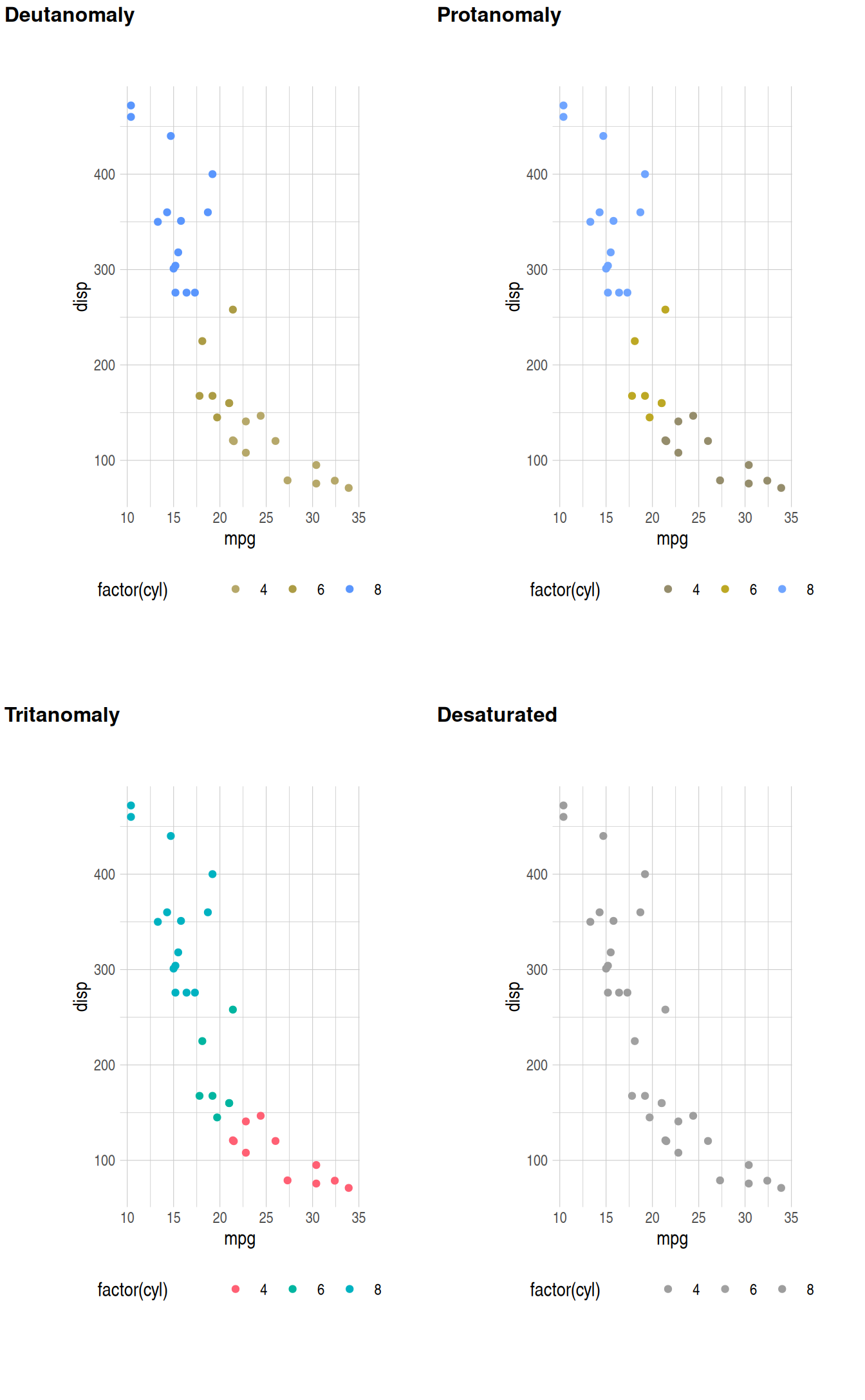
Figure 3: The default {ggplot2} color palette for discrete scales with different types of color blindness.
Figure 3 shows that most types of color blindness make it hard to distinguish between the different level of the cyl variable when using the default color palette. The palette for continuous variables has similar problems. Figure 4 shows the default color palette for continuous variables in {ggplot2}.

Figure 4: Default color palette for continuous variables in {ggplot2}.
The simulated color blindness for this scale is shown in Figure 5. Here, several types of color blindness result in large sections of the palette where it is difficult to differentiate values.
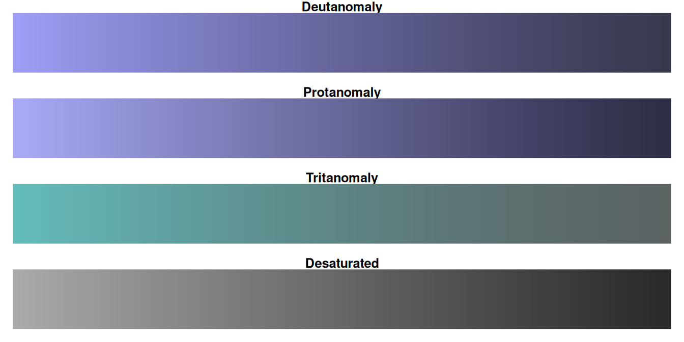
Figure 5: The default {ggplot2} color palette for continuous scales with different types of color blindness.
Using color blind safe palettes
For discrete color scales, the {ratlas} package includes the Okabe Ito color palette developed by Masataka Okabe and Kei Ito. This can be used with the ratlas::scale_color_okabeito() function.
ggplot(mtcars, aes(x = mpg, y = disp)) +
  geom_point(aes(color = factor(cyl)), size = 3) +
  theme_atlas()

ggplot(mtcars, aes(x = mpg, y = disp)) +
  geom_point(aes(color = factor(cyl)), size = 3) +
  scale_color_okabeito() +
  theme_atlas()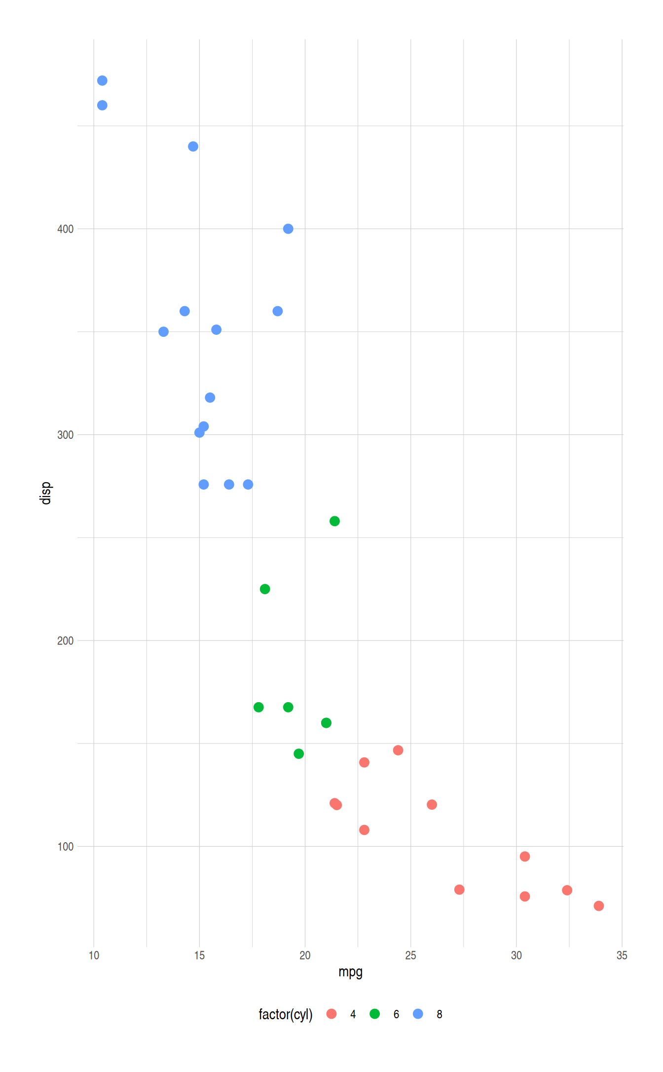
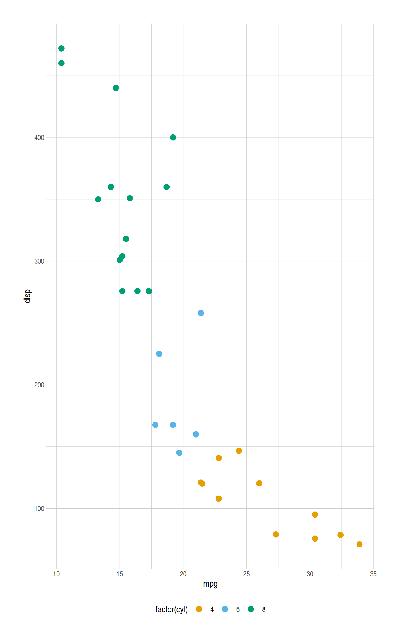
Figure 6: Comparison plot using the default (left) and Okabe Ito (right) discrete color palettes.
For continuous color scales, the viridis family of color palettes should be used. These palettes were created by Stéfan van der Walt and Nathaniel Smith and are shown in Figure 7.
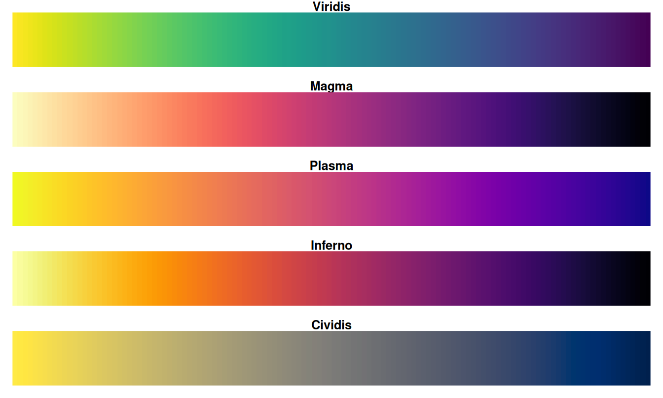
Figure 7: The viridis color scales.
These color scales are perceptually uniform, perform well for a variety of colorblindness, and maintain the ability to discriminate across the perceptual spectrum when rendered or printed in gray scale. These color scales can be applied using ggplot2::scale_color_viridis_c(). Figure 8 shows and example of using the the viridis color palette. There is also a discrete option for the viridis color palette (ggplot2::scale_color_viridis_d()); however, the Okabe Ito palette is preferred for discrete scales.
ggplot(faithfuld, aes(x = eruptions, y = waiting)) +
  geom_raster(aes(fill = density)) +
  theme_atlas()

ggplot(faithfuld, aes(x = eruptions, y = waiting)) +
  geom_raster(aes(fill = density)) +
  scale_fill_viridis_c() +
  theme_atlas()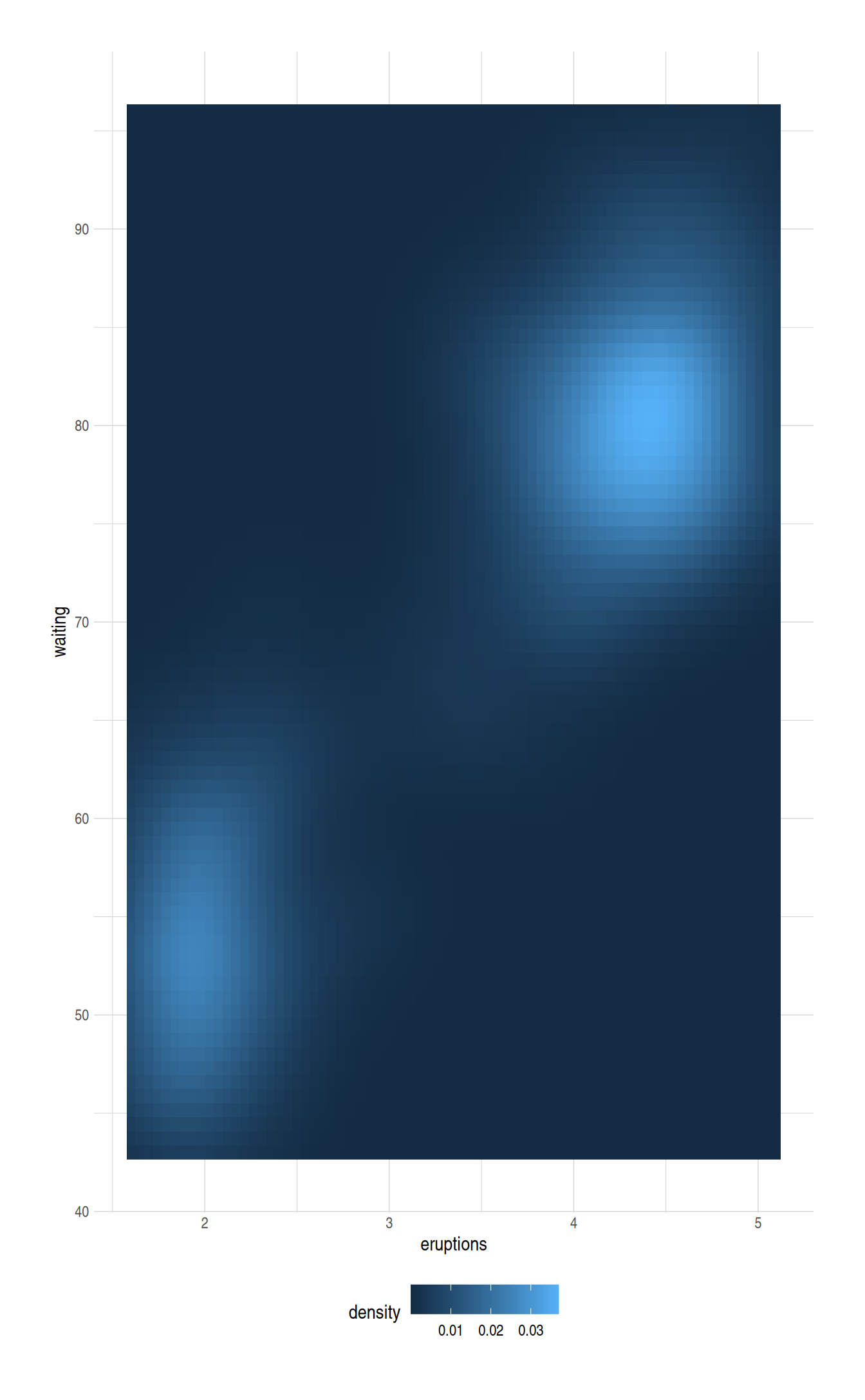
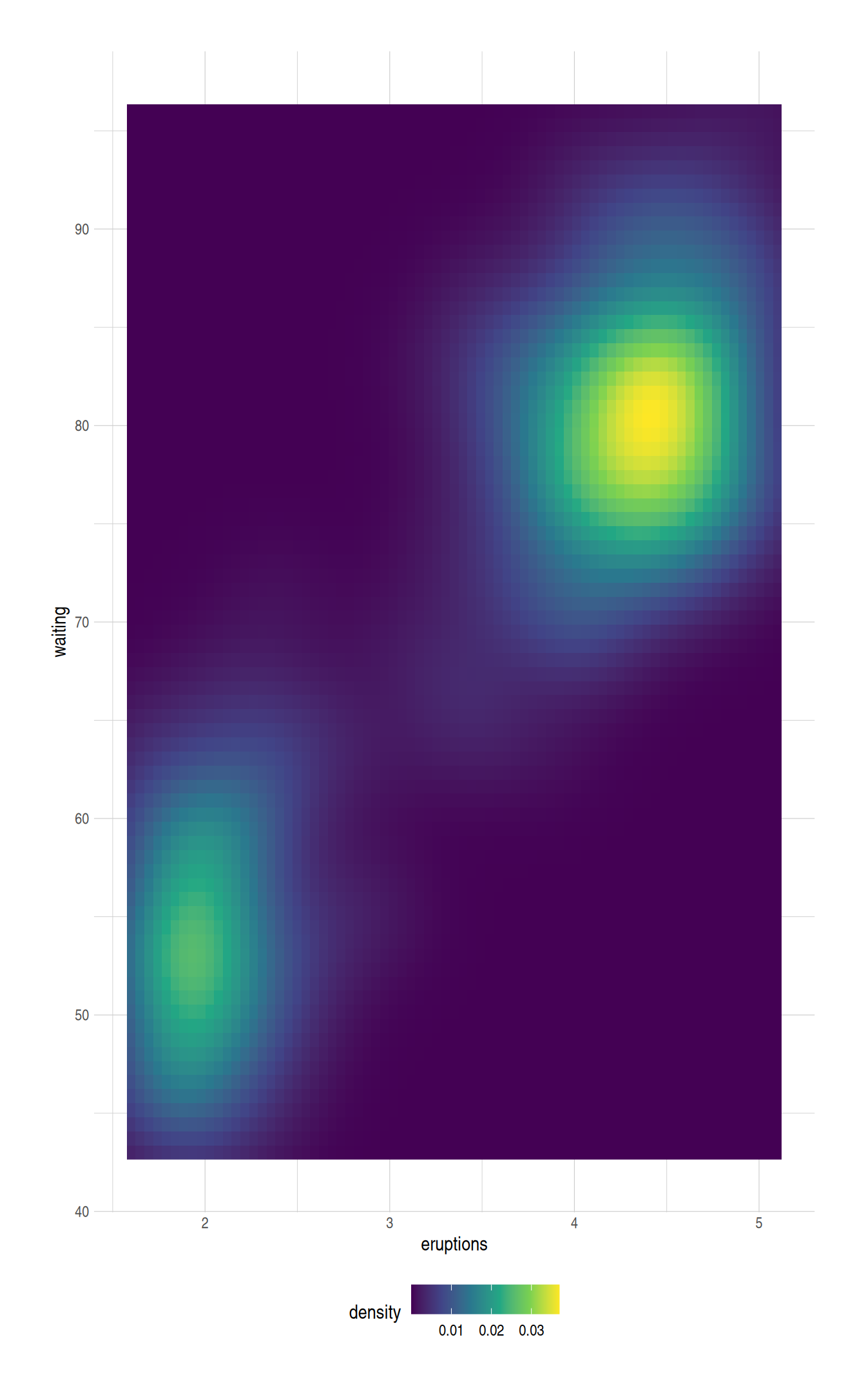
Figure 8: Comparison plot with default (left) and viridis (right) continuous color palettes.
Brand colors
In additional to palettes that are color blind safe, the {ratlas} package also include brand specific color palettes. For example, a plot can be created using the official ATLAS color palette by using the ratlas::scale_color_atlas() function, as shown in Figure 9.
ggplot(mtcars, aes(x = mpg, y = disp)) +
  geom_point(aes(color = factor(cyl))) +
  scale_color_atlas() +
  theme_atlas()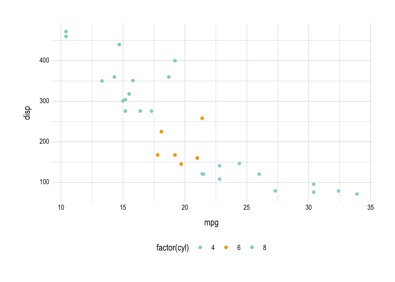
Figure 9: Plot with the official ATLAS colors using ratlas::scale_color_atlas().
Setting a global theme
If you have several plots in a document, it can be a hassle to always remember to add + theme_atlas() to every plot and to switch to a non-default color palette. To make the formatting of plots easier, {ratlas} includes a wrapper function, ratlas::set_theme() which will change the {ggplot2} defaults so that theme_atlas() is always used, and the default color scales are changed to the Okabe Ito palette for discrete scales and the viridis palette for continuous scales.
For example, once set_theme() has been called, the scale_color_okabeito() and theme_atlas() lines no longer need to be added. Instead, they are applied by default (Figure 10).
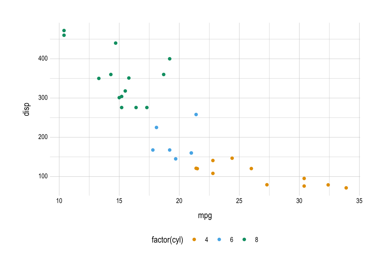
Figure 10: Plot generated after using set_theme() to set new defaults globally.
The set_theme() function also provides flexibility for which defaults are set. For example, to use the Montserrat font by default, use set_theme(font = "Montserrat"). See ?set_theme() for all options.
Saving plots
Finally, it is often useful to save plots to a file. This can be done with ratlas::ggsave2(). This is a wrapper around ggplot2::ggsave(). The ggsave2() version applies some defaults to all ATLAS plots. Specifically, the plot labels and titles are automatically spell checked, the aspect ratio of plots is set to a reasonable default (rather than using the current size of your graphics device), and embeds the fonts when saving to a PDF format, allowing the plots to render correctly on any system.
p <- ggplot(mtcars, aes(x = mpg, y = disp)) +
  geom_point()

ggsave2(plot = p, filename = "my-plot.png", path = "where/to/save")
The ggsave2() function also flips the order of the filename and plot arguments from the ggplot2::ggsave() function. This allows calls to the function to be chained together, making it easier to save the sample plot in multiple formats using the %>% operator.
Keep Learning
There are many resources available for learning more about how to make data visualizations with R and {ggplot2}. Here are a few free resources that I have found particularly helpful:
- For an introduction to {ggplot2}, see Data Visualisation, from R for Data Science, by Hadley Wickham and Garrett Grolemund
- For simple recipes for creating different types of plots with {ggplot2}, see the R Graphics Cookbook, by Winston Chang
- For more details on how to customize {ggplot2} graphics to fit your specific use case, see Data Visualization: A Practical Introduction, by Kieran Healy
- Finally, for a discussion of best principles for data visualization, see Fundamentals of Data Visualization, by Claus Wilke